Results
Who are the biggest emitters? (Based on emission per capita)
The emission data and GDP data of each country from 2001 to 2012 are selected and analyzed in this study. The scatterplots (fig 7 & 8) demonstrate the average emission per capita and GDP per capita over 2001 - 2012. Since the purpose of the plot is to identify the outliers, the relationship between emission and GDP is not the main focus of this study even though scatterplot is applied for data presentation.
As shown in fig. 7, in the term of CO2 emission per capita, the outliers identified are Qatar, Trinidad and Tobago and Kuwait.
As shown in fig 8, in the term of N2O emission per capita, the outliers identified are Solomon Islands, Guyana, New Zealand and Australia.

Fig 6: Per-capita CO2 emission vs per-capita GDP. The x-axis of the scatterplot indicate the GDP per capita (current US $) and y-axis indicates the CO2 emission per capita (kt) for each country.
|

Fig 7: Per-capita N2O emission vs. GDP per capita. The x-axis of the scatterplot indicate the GDP per capita (current US $) and y-axis indicates the N2O emission per capita (thousand metric tons of CO2 equivalent) for each country.
|
Who contains highest emission growth/reduction?
The linear regression between emissions per capita and year are tested for each country between 2001 and 2012, the result are as shown in table 5.
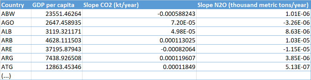
Table 5: the GDP per capita, linear regression between CO2 emission per capita & year, and linear regression between N2O emission per capita & year for each country. Only selected rows are added for display.

Fig 8 : The graph shows the counts of country which
experience reduction/growth in Nitrous oxide
emission/CO2 emission from 2001 - 2012.
|
Based on the linear regression test, from 2001 - 2012, around 35% of countries all over the world have reduced their CO2 emission per capita, while the other 65% of countries remain the relatively same CO2 emission level or even contained emission growth. However, during the same period of time, approximately 57% of countries experienced reduction in nitrous oxide (N2O) emission, and 43% of countries experienced N2O emission growth. |
|
A few outlier countries are identified in term of the trend of CO2 emission, which are Qatar, United Arab Emirates, Aruba, Trinidad and Tobago, and Brunei Darussalam. Among which, Qatar, United Arab Emirates, Aruba are categorized as high income country with relatively higher GDP per capita, but observed with significant decrease in CO2 emission over the studied duration of time. Qatar, especially contains the highest-class of GDP per capita and highest rate of CO2 emission reduction. Trinidad and Tobago and Brunei Darussalam on the other hand contains the relatively low GDP per capita but outstanding CO2 emission growth rate.
|
 Fig. 9: linear relationship between CO2 emission and year vs. GDP per capita. The x-axis of the scatterplot is GDP per capita (US $), and the y-axis is the slope that calculated from the regression between CO2 emission and year from 2001 - 2012 for each country. A slope >0 indicate the emission growth over year, while a slope < 0 indicates emission reduction over year. Each dot represents a country, only selected countries are labeled. Abbreviations are the country codes. Fig. 9: linear relationship between CO2 emission and year vs. GDP per capita. The x-axis of the scatterplot is GDP per capita (US $), and the y-axis is the slope that calculated from the regression between CO2 emission and year from 2001 - 2012 for each country. A slope >0 indicate the emission growth over year, while a slope < 0 indicates emission reduction over year. Each dot represents a country, only selected countries are labeled. Abbreviations are the country codes.
|

Fig 10: Linear relationship between per-capita N2O emission and year vs. GDP per capita. The x-axis of the scatterplot is GDP per capita (US $), and the y-axis is the slope that calculated from the regression between Nitrous oxide emission and year from 2001 - 2012 for each country. A slope >0 indicate the N2O emission growth over year, while a slope < 0 indicates emission reduction over year. Each dot represents a country, only selected countries are labeled. Abbreviations are the country codes.
|
The outlier countries identified in term of the trend of nitrous oxide (N2O) emission are Guinea, Guyana, Botswana, Zimbabwe and Australia. Among which, Botswana and Zimbabwe are two countries with relatively low GDP per capita but contain highest rates of N2O) emission reduction. Australia contains the highest reduction rate among high income countries, while Guinea contains highest growth rate of N2O emission among low income countries, and Guyana contains highest growth rate among middle-up income countries.
|
Discussion
Environmental Kuznets curve (EKC) (fig. 2) suggests that pollution emissions increase at early stages of economic growth, so that countries with relatively low GDP per capita are expected to contain higher emission, while at high income levels, economic growth leads to environmental improvement. However, this hypothesis is not fully supported by this study. In this study, the GDP per capita and CO2 emission per capita is visually observed positively correlated, even though the correlation is not statistical analyzed. Especially, the highest CO2 emission per capita is owned by Qatar which is among the countries with highest GDP. Since the industry and energy sector are the major contributor of Qatar's economic growth, the high CO2 emission per capita is considered reflective to its strategy of development which is highly energy and resource-dependent. On the one hand, economic growth leads to better technology which reduces emission, on the other, it can also result in greater resource use which intensifies the emission.
The plot of N2O emission per capita (Fig. 7) fits the hypothesis of EKC (environmental Kuznets curve) better, that more countries with low per-capita income are observed containing higher N2O emission. But the per-capita emission of countries with high income level are not significantly lower than the rest of the world. Since N2O emission is mostly agriculture-related (EIA, 2009), the countries with low per-capita income that highly rely on agriculture are expected with higher per-capita N2O emission, this assumption is also reflected in the result of study.
When looking at the emission trend of countries over time, we can see that more countries have reduced their N2O emission per capita but increased CO2 emission per capita. Countries with high GDP generally do a great job in emission reduction with few exceptions. Which arises my attention is that, Qatar contains both the highest CO2 emission per capita and the highest reduction rate of CO2 emission per capita during the same period of time. Government regulations, renewable energy development and increased environmental awareness are all considered as the factors which may cause the reduction. Zimbabwe contains the highest rate of per-capita N2O emission reduction while having relatively low per-capita GDP. Due to the lack of information, the direct factors of reduction is not found, however, agriculture-related policy and low-emission agricultural practices applied may have lead to the overall emission reduction in Zimbabwe.
Limitations
The linear regression between emission and year is assumed, however, the linear relationship for some countries are observed not quite linear. Because of which, for the countries which experienced abrupt change in emission, the trend of emission may not be completely reflected by the slope calculated from the linear regression, thus, the result may be biased.
Since the outliers identified in the study is not analyzed statistically, and may be identified based on biased linear relationship, the choice of outliers may also be biased.
